Greige and white color schemes are super trendy right now and for a valid reason. We had all been subjected to earth tones for so long, it was actually quite hard for the public to grasp the concept of gray in a color scheme. But greige is not gray – and here’s why.
How The Staple Earth Tone Became Dated
I can recall color marketing teams giving seminars at the late 1990s about blue becoming “the color of the new millennium”. Like clockwork, we were told Cerulean would be the color of the year for 2000. I was not alone in my skepticism of relinquishing my favoritism toward the warm and wonderful earth tones.
We all waited to see this new blue emerging. From tile manufacturers to carpet weavers, drapery, flooring, and sofa manufacturers – everybody was trying to thrust blue upon the population. It was slow to catch on in mainstream America. That is an understatement.
All the way through 2009, we were still seeing greens, golds, browns, or orange tones selling and selling and selling. While blue never dominated the major populace, gray became strongly accepted around 2010, maybe a bit earlier in coastal areas of the US.
This was a blue-gray and perhaps those who were pushing for blues were rejoicing that their forecast was finally coming to fruition. The grays that came about were very cool in tone and almost felt oppressive. They were definitely a departure from the warmth of the earth tones, almost in stark contrast.
Color trends follow the economic trends. Every. Single. Time.
If you want to look around and see how colors are trending, just open the Wall Street Journal.
Because of the downturn in the economy in 2008, people didn’t feel joyful enough to be around warm, comforting earth tones. It seemed that all of us were feeling insecure, fearful of where we were all headed, and desperate like our generation had never felt. Gray seemed to be the perfect color to emulate that feeling.
But gray is a challenging color to live with because no matter what you do with it, it isn’t welcoming. Gray is sad, gloomy, and overcast. It needs a warm color to lift it. Designing with gray is harder than imaged especially for those of us on the marketing end. How to convince the public to buy when the color we are using is depressing? Thus the emergence of greige.
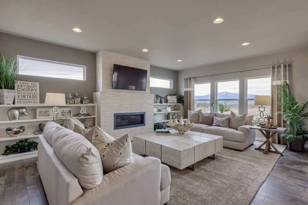
Greige is a combination of gray mixed with beige. It is warm, welcoming, and sophisticated.
The wonderful thing about color schemes of white and greige is that while those two colors are not enough to carry a solid scheme, they provide nice backgrounds and allow accent pieces and accessories to provide the punch.
While blue-grays can still be found in paint colors and fabrics, since the downturn in the economy in 2008 and now the pandemic, everyone is feeling beat up but exhausted. Gray is not fitting the bill – we need something else.
That’s where greige is so well-suited for the times. It still acknowledges to our sense of insecurity from what we have come through, but it is warm in a sense that we made it – as if we have emerged from this oppression, even though we have not. That is what colors are so good for. Color trends really acknowledge our feeling of the world around us.

Wall color: Sherwin Williams 7031 Mega Greige
Why greige is here for the long haul
You can accessorize a greige and white color scheme easily and change it up so economically that it is really fluid for the post-pandemic world. We are all in a period of adjustment. So in design, we do not want to commit to any specific colors.
Greige is such a flexible color to use. It is not cold – it is warm. It is welcoming. It is the cheering crowd at the finish line as we wrap up this pandemic and look forward to the new normal.
Schemes like greige and white will be here for quite some time. It is crisp, flexible, and sophisticated. We all need to feel validated right now between our economic losses, job losses, loved ones who have fallen to the pandemic, and those of us who are carrying on. It sounds very deep but when looking at colors and their direction this is certainly where the trends come from.
We will recover from pandemic for a good ten years for sure. I feel confident in telling people feel free to embrace this color scheme and apply it to your homes as it will feel fresh and modern for years to come.