You worked so hard on your latest room décor, but the color scheme still feels flat. Is something missing or is it just not working? It is fair to say that when designing interiors, most people the only consider colors in their furnishings. But there are two elements that always get overlooked!
The First Element: Wood
I love starting a new design project. Gathering all of the necessary information to create a new space is exciting! Inevitably, the conversation goes, “What colors do you want to live with?” and I hear replies such as “gray, red, and black” and that’s it.
Never is there a mention of wood tone at all, even though it is an element in almost every room of a home.
Wood tone is a key factor within every design scheme and should be considered consistently throughout your space. What do I mean by this?
When designing an entire home, the wood tone throughout should be consistent
For most people, the wood tone is established with your kitchen cabinets.
If you don’t like the color of your cabinets, not to worry! There are loads of do-it-yourself videos on how to change out the color of your cabinets without reinstalling an entire kitchen. Painting or staining your cabinets can look amazing with all of the cool items available at the retail marketplace right now.
When gathering inspiration photos for your project, take a look at the wood tone of the items in the picture.
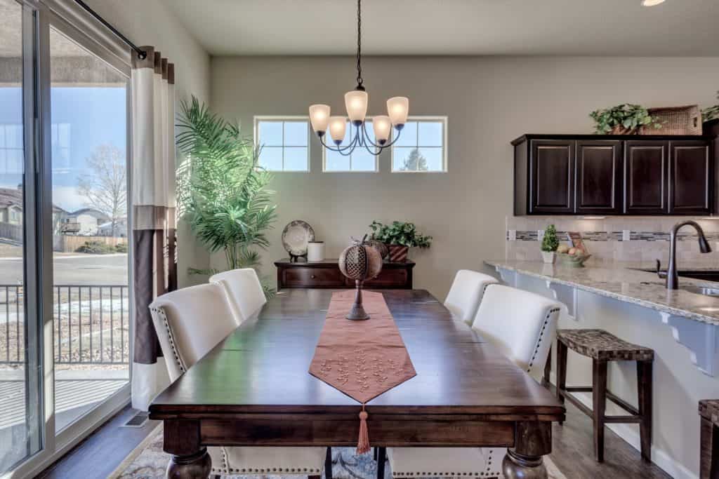
This photo (above) is a home that was almost completely neutral ivory and beige but look at all of the espresso wood! The wood tone helped to anchor the color scheme.
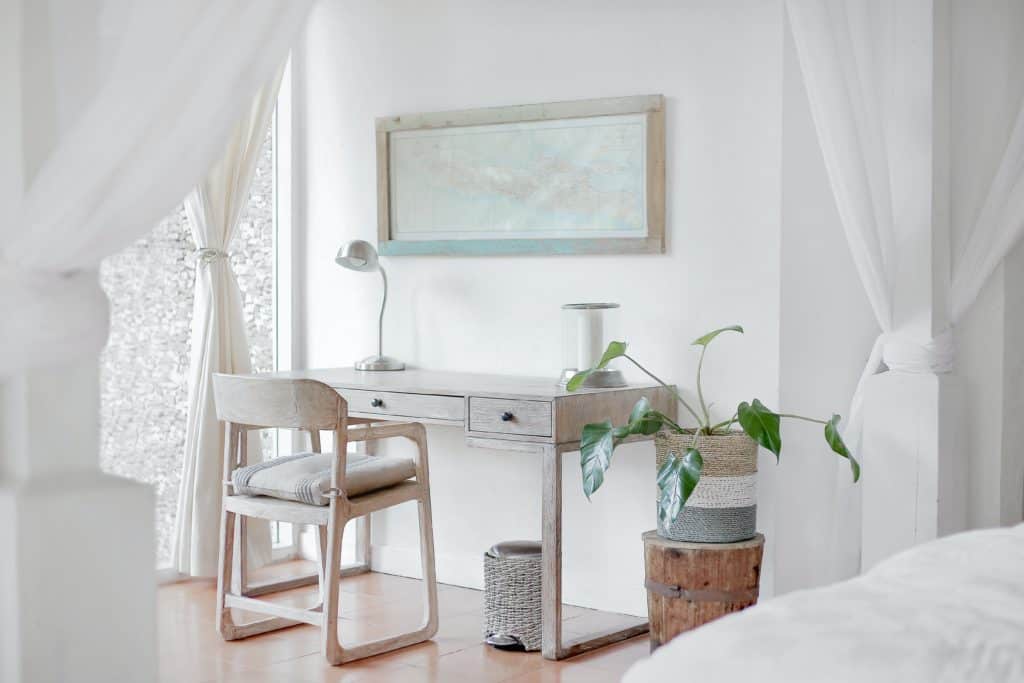
Often times with the popular light color schemes, the wood tone is either white or espresso. Sometimes it is unfinished alder or a light maple, and all of those combinations can work spectacularly.
Remember that when you step back after you have installed your new furnishings, the wood tone is going to be a part of the colors that you see.
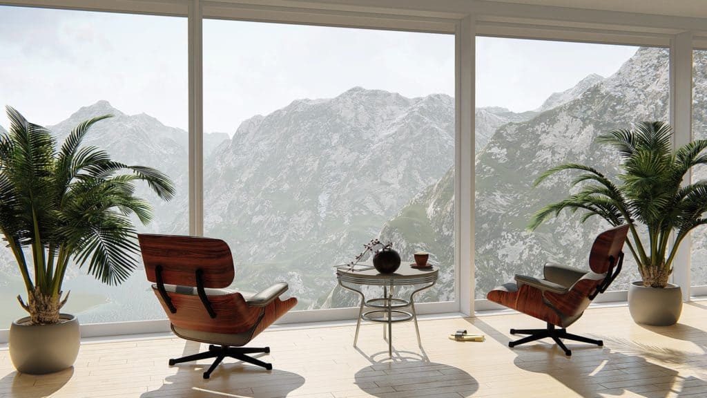
The wood tone can even be gray, which looks great with a white background.
Now you are free to add your accent elements. Consider pops of bright colors for a powerful impact. Maybe a beautiful teal or a rich, royal blue would really spice up the room. Those combinations will look amazing!
Vantage points and furniture placement matters
When you are selecting furniture, determine what items will be seen from different vantage points.
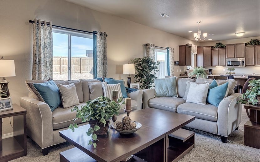
If you have half of your items in a deep espresso and the other half in a soft ivory, be sure that these items are mixed thoroughly. You don’t want all of your dark pieces in one part of the room.
It is no good thinking that your very light home with white cabinets and white walls will have a deep espresso wood if you only have one piece of furniture with that color. That espresso will now feel like your accent and not part of the scheme.
Also, be sure to consider the legs of upholstered pieces as that wood should also feel cohesive.
Wood tones don’t need to match exactly throughout a home, as that creates monotony. But the wood tone should definitely feel harmonious within the pieces. Often times as I am working on a project I just focus on items such as “dark wood” or “light wood” and as long as I am in that realm when it all comes together, it feels beautiful.
The Second Element: Plants and Foliage Color
Every space should have live plants if possible for good Feng Shui. Choosing the right plants can be that perfect “cherry on top” element of a room. When selecting plants, take notice of the colors of the leaves and integrate that color into your scheme.
As you are working through your beautiful new design, think about the accent color of the greenery that you will want to use.
Are the leaves a soft seafoam color or a deep rich hunter green? Is it a palm tree was with sort of a pea-green look? These are accent colors that will absolutely appear in the room.
In addition, you will definitely want to consider the pots for plants to sit in. What accent color will you use for those? Adding the perfect style and color of pot for your foliage is key in making the scheme come together.
I have certainly walked through projects with a blue and ivory scheme only to see a bright red pot housing a beautiful plant. When done wrong, it is a distraction.
The Second Element: Plants and Foliage
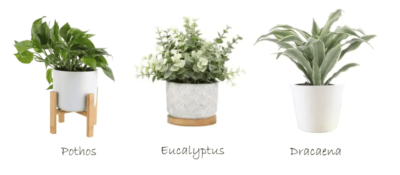
Plants have a style to them as well, so if you are working in a contemporary home you probably don’t want to have a lot of Pothos around.
In contrast, if you have a very traditional home stay clear of the spikier plants such as Dracaena, which tend to lend themselves more to a modern or contemporary look.
I would say however the one theme where you can fudge this is Grandmillennial. That look is so eclectic, you can push the boundaries and still be right. Perhaps an enormous, lush fern would work in that style.
An effective way to keep the foliage in focus is to look up different types of plants at the planning stage of your design. See the styles you like and grab a paint color swatch of something very similar to represent it as you are putting your room together.
This will help you keep that color in mind while you design. You won’t have any surprises when you install your plants in the end.
Plants are always the last thing we pop in and they can really change the look of a room. You add so much color with the plants, it is a shame they get overlooked in the scheme of things (pun intended).
I hope these two overlooked items help you to finalize your color schemes. Be sure to contact me if you have any questions. I’m happy to help!