
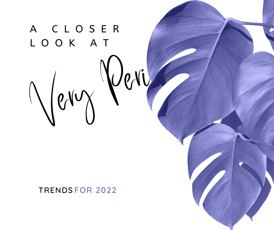

What is Very Peri? Last December, Pantone introduced its color of the year for 2022 and surprisingly they settled on Very Peri as the winner. A shade of periwinkle was an interesting choice. Generally speaking, my experience with any shade of purple is that it is quite a polarizing color. But I must remind myself that periwinkle is not in fact purple, but its own color. So let’s address that.
It is interesting to note this is the first time in its history that Pantone has actually created a color for its color of the year.
Thinking about this, I realized that it’s appropriate for the tumultuous past couple of years that we have come through. Between lockdowns, viruses, and now an impending war raging through Europe, trends need to focus on something brand new.
Trends always reflect the economy and outlook of how the population is reacting to reality. With that in mind, creating something new represents the rebirth we are all hoping for.
As such, Pantone describes on its website its reasoning behind creating this new color. They have stated that the process started with a “trusted” blue as the core and added the “joyous attitude and dynamic presence” of a red-violet undertone which created this beautiful periwinkle color.
I actually think they are spot on with this hue.
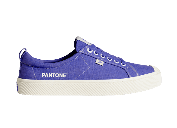
Very Peri is still having a bit of trouble taking off in the interior design market however. This color of the year was introduced to the public a few months ago. As Spring approaches, we are just starting to see it take hold in retail markets in the form of accessories.
The trouble with integrating interior design and color trends is that substantial pieces, such as sofas, chairs, area rugs and the like, can be quite costly to change.
However, I do believe in updating your home as much as possible. Reflecting current trends keeps your surroundings fresh.

Photo by Raden Prasetya on Unsplash
The worldwide repression of the past few years has created a need to rejoice and to feel free again.
In looking at the Spring fashions for 2022, there is an underlying message of the color palettes being presented to the public. Designers are pushing a palette that is cautiously cheerful. Designs are powerful and geometric. They are also decidedly turning their back on solid neutral blacks, browns, and grays.
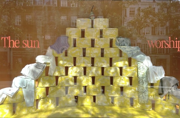
A window display at Selfridges, London, 2021
When I spent time in London last Fall, I couldn’t help but notice prominence of a shade of popcorn yellow.
It was absolutely beautiful. Paired with gray, white, and cream, this soft buttery shade was everywhere. When I landed back in America, there was not even a hint of it in the marketplace at that time.
What does this have to do with Very Peri?
Well, now looking at the color trends for 2022, I am seeing a definite nod to that color and forecasters are saying we will see more of it in the Spring. Interestingly, designers are pairing it with Very Peri.
That is all good and well for fashion and accessories, but what about interior design?
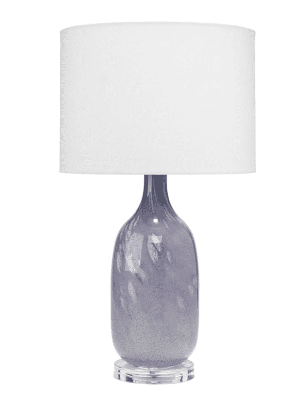
We typically see color trends come and go in accessories much quicker than in more substantial pieces. That said, I have yet to see this periwinkle showing up in the furniture marketplace and we are into March already.
So I do wonder if Very Peri will take hold in the interior design market.
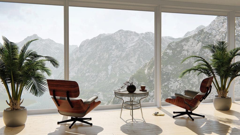
I have created a look book addressing how to incorporate this beautiful color into your interiors if you enjoy Very Peri. With this, I have kept the periwinkle tones to accents and area rugs and it works beautifully with modern and minimalist design.
A great place to add this beautiful color, is on your walls!
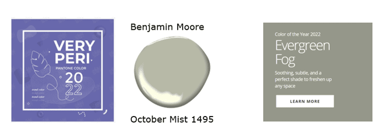
Benjamin Moore has a beautiful selection for their own color of the year in their palette called October Mist, which works in amazing harmony with the Very Peri color of Pantone. Together these two create a synergistic feel that definitely responds to the economic climate that are experiencing right now.
In addition Sherwin Williams is closely following suit to Benjamin Moore with their own color of the year, Evergreen Fog.
The big takeaway on this color is that perhaps it should be used as accents and in pops of color.
As it has been in the marketplace for almost six months, it may be fair to say that furniture manufacturers will refrain from including new pieces with this color. Seeing a variety of accents we can still play with allows for an easy change up to freshen any interior!