One of the worst comments you can get about your home is that it looks dated. We all get stuck in a rut where we don’t even see what is around us. Because interior refreshes can be time-consuming and expensive, dated looks creep into our surroundings at record pace.
As a designer, I’m always walking through homes of potential clients and having to evaluate how I can help them update their home while typically on a slim budget. It’s distressing to see the same mistakes being done over and again so I wanted to write this blog post to help!
Dated Look #1 – Using Accent Paint Colors All Over The House
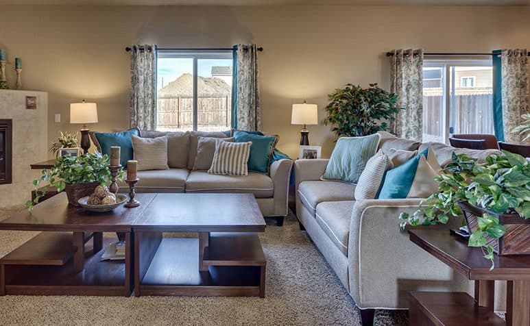
Sorry to break the news, but the days of muted or bold color on all of your walls are all but gone. Painting a hallway or all four walls of a room with a strong color is just a NO right now. That said, it’s easy to see where the color trend went wrong.
When designing model homes, strong wall treatments are used to draw people into a room. Typically it is on one wall, maybe two. There’s a psychology to it that is directly related to marketing. Professionals use this technique all the time to help to sell a look, but that doesn’t mean that it will necessarily work in a residential setting.
So, replicating this technique isn’t exactly what you want to do for a calm, residential experience.
As I walk through residential homes, I often see that people have engaged in painting their walls deep, muted colors. Frequently, there are multiple colors and schemes being changed from one room to another. While this was a trendy look in the 1980s & 1990s, today’s homes are much more sophisticated. Even if a rich accent color is used in a scheme, it wouldn’t be a color that was popular in decades past.
You should also be considering the architecture of your space. Many homes today are designed around the open floor plan concept. With this, you will want to keep your colors, theme, and scheme tight and consistent.
If you want to update your look, start by finding one neutral color and using that on all of your walls. Some great neutral colors from Sherwin Williams that I have used successfully are:
- SW 7009 Pearly White – a simple white
- SW 7029 Agreeable Gray – a perfect, neutral gray
- SW 7647 Crushed Ice – a cool gray
- SW 6076 Kilim Beige – if you want something neutral but warm
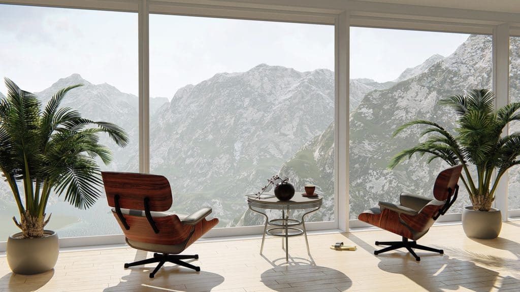
A photo from Ellen Phillips Interiors
Once you have your background color(s) set, you may want to add a pop of color on a wall. Here are some easy ways to update your walls like a pro:
- Try using a tone on tone match. When doing this, just go two or three steps up on the color sample from the supplier.
- Use bold shades of red, green, blue in niches ONLY
- If you want to paint a full wall accent, error on the side of a lighter color & stay clear of red. Red is way too easy to get wrong.
- Try adding a crisp, white wainscot to a room with a dark wall color for added interest!
Photo by Ellen Phillips Interiors
Enlisting the help of a certified designer or color specialist can save you hours of time and a lot of money in wasted paint. However, if you are going it alone, here are some thoughts on interior paint:
- Remember that even the lightest color can “pop” off of a white wall. Subtle grays will look spectacular next to white!
- Trim colors should always be white. There was a trend in the early 2000s to paint trim dark, tan, and even black. That has passed and this look looks dated now.
- If you decided to choose an off-white, remember that the base will be either yellow (warm) or blue (cool). A blue base for a white color can appear purple in the light, so consider this when making a trim color selection. Sherwin Williams 7008 Alabaster is an excellent starting point for an off-white trim. Remember that you want your trim to pop.
- Don’t paint a kitchen red – ever. It’s dated. Just no – don’t do it.
- Do try to keep your ceilings white. This will add cost to a painting job, but honestly cry once and pay for that installation. You will be glad you did. Paint color other than white will make the ceiling look low and it will darken the entire room.
- Do use a flat or satin finish for walls. Every paint supplier seems to have their own name for these finishes. Ask your sales representative for their version of either flat or satin. Flat looks best but is unforgiving when it comes to marks on the walls and cleaning. Satin cleans easier but has a slight sheen to it. Both are fine, you make the call for your needs.
Dated Look #2 – Silk Plants
Good Feng Shui means bringing living plants into your spaces. They are easy to maintain and add beauty to your home.
Too often I see an old, dirty silk plant left over from the 1980s in homes today! Get rid of them! They are dust collectors and outdated.
If you can’t have real plants in your home due to travel and the inability to keep them watered, there are some fresh looks in new artificial plants that really work quite nicely. They are made with different textures and materials other than silk for a fresh, updated look!
Be sure that you are selecting the right type of plants for your interior style as well. You can read more about that on my blog post here.
Also check that the pots for your plants are fresh and clean. Updated looks include ceramic pots instead of the old woven wood baskets. When in doubt, opt for a nice, white pot for all of your foliage. This will look fresh and up-to-date.
Dated Look #3 – Art That Doesn’t Mean Anything To You
Art is another giveaway when it comes to looking out of date. Old trends that should be removed from your home include:
- Rustic iron work or metal art
- Framed scenery that doesn’t relate to anyplace you have ever been
- Heavy, oil paintings
- Framed school photos of children who have long since moved away
- Any piece of art that has been hanging on your walls for more than fifteen years
These are all items to take down now. Allow yourself the space and time to refresh your walls. Looking at the same old thing for years upon years can’t possibly feel fresh. Change it up! If you don’t want to get rid of a specific piece, just allow it a break by storing it away for a while and treat yourself to something new just for a bit! Chances are you will love the new look and forget about the old one.
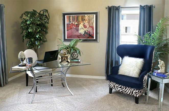
Photo from Ellen Phillips Interiors
School photos also seem to be a big issue, so I’d like to address that here. If you have photos of your children that you want to display, here are some guidelines to follow:
- Frame and display only significant photos (senior photos, graduation photos, prom photos)
- Never hang up photos from grade school and younger – leave those for a desktop or bookcase collage.
- Select a fabulous frame that complements your interior finishes & design style (wood tone, metal color, etc.)
- Add a matting to amplify the photo. If you are hanging a framed photo, the matting should be at least two inches around the perimeter. Thus, an 8×10 photo should display in an 11×14 frame, or larger! Never display a beautiful school portrait on a wall without a matting.
Dated Look #4 - Surviving Farmhouse
We have all lived through the Farmhouse craze, which is now in its waning years. Unless you have chosen an Americana-style décor, which is a variation of Farmhouse, perhaps it is time to revisit your artwork that may reflect that trend.
Americana can be a really fun style of interior, but that also needs to be updated to keep it looking fresh. If you have opted for this style, you probably have a blue or red wall somewhere. Perhaps it is time to give that a fresh coat, or maybe even change the color.
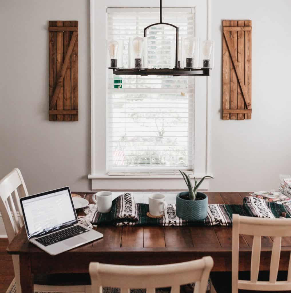
A photo by Camylla Battani
Look around at your accessories, which for both Americana and Farmhouse, can borderline on clutter. That’s the look, but it isn’t an excuse to fill your rooms with excess items that can appear to be junk. Be very cautious of adding too many random elements that don’t make sense with each other.
Farmhouse art also consists of miscellaneous metal art.
For any type of metal art to work in a residential setting, it needs to be spectacular, substantial, and, honestly, quite expensive. Finding random metalwork is easy at big retailers, but I have yet to find one piece that looks fabulous. Your artwork should stand out, not just be a “this is fine” piece.
Inexpensive metal art is typically unsubstantial and will flex and bend easily. This just looks bad and really dated. If you are trying to update your home, stay away from these options. All of them.
Dated Look #5 - Quotework extravaganza
If you are cautious of dated looks, another issue that you should pay attention to is the abundance of “quotework.” We all love art that displays a wonderful quote, reflective to how we feel or dream of living. They’re nice. However, be cautious of living inside a lecture hall.
I’ve walked too many homes, (far too many), wherein nearly every wall is decorated with a piece of art with a quote on it. I feel as though I’m reading my way through the house.

Image by Oberholster Venita
Save those special pieces for one significant place where you can read it and reflect on it. One or two pieces of quotework is the maximum for any single floor of a home. That said, if you have a two-story home and you love quotework, feel free to add another piece on a different floor.
Be very aware if you have five or six pieces in one space. That is far too much. Keep the one or two that you love and ditch the rest.
Updating your home has many layers and I’ll have more blog posts relating to window treatments, bedding, and interior finishes. Check back for more!